A Graph-based approach to community detection in Twitter Networks

Generating A Twitter Ego-Network & Detecting Communities
Preface: The work of colleagues and I will expand upon this but has been halted. The work below that was conducted in 2018 by a group of researchers is vital to understanding how and why certain communities are being targeted.
Our hearts have not even been engaged — nor, for that matter, have our ears! We’ve been much more like someone divinely distracted and self-absorbed into whose ear the clock has just pealed the twelve strokes of noon with all its force [a twitter notification wakes you up] and who all at once wakes up and asks himself “What exactly did that clock strike?” (What exactly did he/she just retweet, is it saying what I think it is..?)— so we rub ourselves behind the ears afterwards and ask, totally surprised and embarrassed “What have we really just experienced? (Did this really just happen?) And more: “Who are we really?” (Why did I follow him/her?)Then, as I’ve mentioned, we count — after the fact — all the twelve trembling strokes of the clock of our experience (We look through all their tweets), our lives (our tweets), our being (our followers)— alas! in the process we keep losing the count. So we remain necessarily strangers to ourselves, we do not understand ourselves, we have to keep ourselves confused (we subtweet them). For us this law holds for all eternity: “Each man is furthest from himself.” Where we ourselves are concerned, we are not “knowledgeable people.” — Friedrich Nietzsche
Im pretty sure Nietzsche predicted Twitter. Strange as it may seem to start my data science related post in such a manner (and with such a quote), this is really our motivation behind the task — an attempt to become ‘knowledgeable people’, to become closer to ourselves by understanding those close to us (virtually).
Twitter is.. strange to say the least. A good chunk of the people I follow have, more than once, complained about the uselessness of Twitter and their addiction to it.. on Twitter. I’m not sure what it says about a platform when it’s used to complain about itself, but what I do know is it pulls you back in. Twitter is like Plato’s cave where we see the shadows dancing except we are consciously facing it and are technically ‘free’ to turn away, but often don’t. It’s not all so dread and gloomy, we must admit Twitter allows us to house a micro-internet of sorts with some freedom to define our own custom rules as we act as a hub for incoming and outgoing connections. And as this hub grows — as we follow and are followed by more and more users — , it molds and mends into something personal, containing a mix of latent properties that explain our interests and even some parts of our personality. As a hub, we entertain and are entertained by a network that we have created over time: an Ego-Network (a term coming from sociology) with us as the focal point, extending our virtual limbs to touch and feel other egos and the elements of their own ego-networks.
Regardless of your opinion on Twitter, it can be a rich dataset and this project aims to use that data to model and analyze a Twitter Ego-Network. To be able to perform more in-depth analysis we will have to complete some preliminary steps. Therefore, in this post, I will discuss only the first stage of such an analysis: modelling the network and performing some high-level soft analysis via community detection techniques.
Future stage(s) will attempt to look deeper and analyze linguistic elements using Natural Language Processing techniques.
Outline
1. Data Mining
2. Network Modelling
3. Community Detection
4. Observations & Analysis
This post is written with a general audience in mind to show how some of this work is done and I will avoid overly-technical talk — hopefully making it a relevant and interesting experience for everyone. However, I will provide enough technical references for readers who have some basic coding experience to be able to learn what tools can be used to perform any similar analysis. (I can show the code upon request as well)
Technical Notes
All programming, data mining, algorithm application, etc. was done in a Jupyter Notebook (Python) from a base Docker template.
#Libraries Used:
tweepy
i-graph
networkx
tqdm
pandas
numpy
matplotlib
seaborn
pickle
json
Gephi was used for Network Visualization which outputs both .png and .svg formats. Both i-graph and networkx libraries can output graphs in .gml format from the Python object which can be read in using Gephi and organized, coloured, partitioned, and so on and so on.
Data Mining — Let’s get that Data
The data for this project is extracted from Twitter using Twitter’s API. Unfortunately, it is not quick to mine given Twitter’s rate limits which only allow a certain amount of calls for a given time window. To generate our network we need the following:
- account/verify_credentials — To get rootUser’s [a.k.a. my] info
- friends/list — Return info for each user rootUser is ‘following’, we call them ‘friends’ [~300/15min]
- friends/ids — Return ids of the users rootUser’s friends are ‘following’, as in get ‘friends of friends’) [~75,000ids/15min or 15users/15min]
- statuses/user_timeline — Get up to 3,200 most recent tweets of any given user [~36,000tweets/15min]
Using a python library called Tweepy, which automatically waits to take into account rate-limits, we can get Twitter’s API responses and store them into JSON files. The files can then be read and put into a data structure (Dictionaries or Pandas DataFrame) for the rest of our process.
Network Modelling — How do we quantify what we see?
One of the most important steps with any data-science analysis is to give time and thought to how you will quantify the problem. Often, we tend to jump to models and algorithms when the underlying data and means we’ve used to quantify our reality are weak.
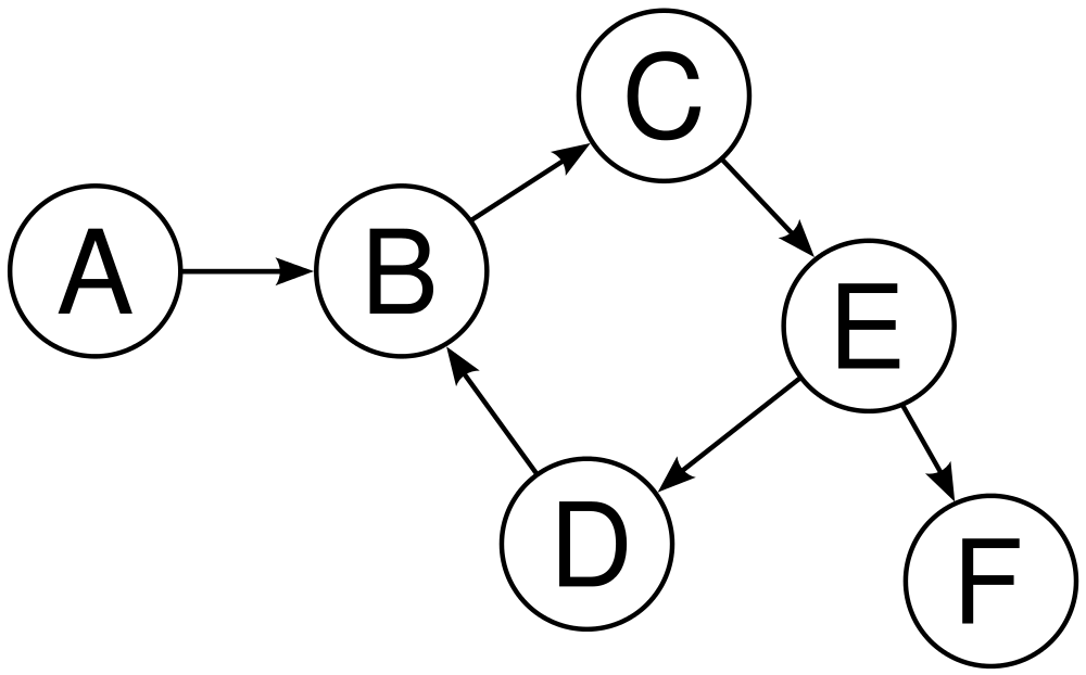
We are going to be making a 1-step Neighbourhood as it’s called in sociology— in the sense that we will go only as deep as 2 layers of friends but with the condition that we will remove any friends of friends that are not the rootUser’s friends. So, we will look at the rootUser’s [my] friends and any connections between them. (A ‘friend’ of a user is twitter’s official term to describe a person that the user ‘follows’). Since to build our network, we are more interested in what the rootUser ‘sees’ rather than how they are ‘seen’, we will look at their friends rather than their followers. The network will be a directed graph-based network (Figure 1), meaning we are dealing with nodes and directed edges primarily. The basic setup:
- A node will be defined as a User.
- An edge connects 2 users (nodes) together based on some relationship. In this sense, if User A follows User B, an edge will go out from Node A and go into Node B.
While this comprises the basics of the network, we can intuitively see that each ‘I’m following you’ relationship can’t possibly have the same ‘weight’ — that uncle of yours who lives miles away that followed you 4 years ago as a means to be ‘hip’ has a very different role in your network than your mutual who retweets everything you ever do, ever, all the time. So we introduce some complexity in our network by modelling weights (for both edges and nodes). The assumption made in this project is weights are quantified by ‘activity’ (this will also play into the type of community detection we choose later as well).
- Edge weights will be a function of various connections between any given Users — the amount of retweets, replies, and quoted statuses in your recent history. We will also quantify the ‘I follow you’ connection as well under the assumptions that A) if a user has a low following-to-follower ratio, it makes their following someone more ‘significant’ and B) Users with more followers following users with less followers is more ‘significant’ than the other way around. This leads us to the equation:
EdgeWeight between a & b
     = (w1 * RT_ab) + (w2 * Qtd_ab) + (w3 * Rep_ab)
       + ( w4 * (Rff_a * (FC_a - FC_b) / (FC_a + FC_b) )Rt_ab = # of A Retweets B
Qtd_ab = # of A Quoted B
Rep_ab = # of A Replies to B
Rff_a = Follower to Following Ration of a
FC_a = Follower Count of a
FC_b = Follower Count of bw1,w2,w3,w4 = (manually assigned) weights of each connection
w4 > w3 > w2 > w1
The terms w1, w2, w3, w4 were chosen intuitively to order the significance of each term (according to the way I interact with Twitter) — following was worth more than replying was worth more than quoting was worth more than retweeting…
- We can also assign weights to the nodes themselves based on user activity. Understandably, regardless of connections, a User is generically a stronger part of my network if I (and my friends) see them more often.
NodeWeight of a = ~ Avg # of tweets day based on recent historyTweets include RTs, Quoted Statuses, & Replies.The graph can be modelled using the python library i-graph or networkx. Networkx is good because it allows straight imports from Pandas Dataframe but there are more options for community detections algorithms on i-graph. Personally, I modelled them in both… i-graph to get community assignment and then some preliminary visualization using networkx (since it works with matplotlib unlike i-graph)
Network Stats: Distributions of Node and Edge attributes
When interpreting the charts below, note that most axis are log10-scaled to see a spread of values more clearly (such that 2 on the x-axis means 100units, 3=1000units, 4=1000units, etc.). Also note that the y-axis values for Node Stats is density rather than count (such that the area under the curve equals to 1). Regardless, we are interested in viewing the general distributions — which values appear the most or least.
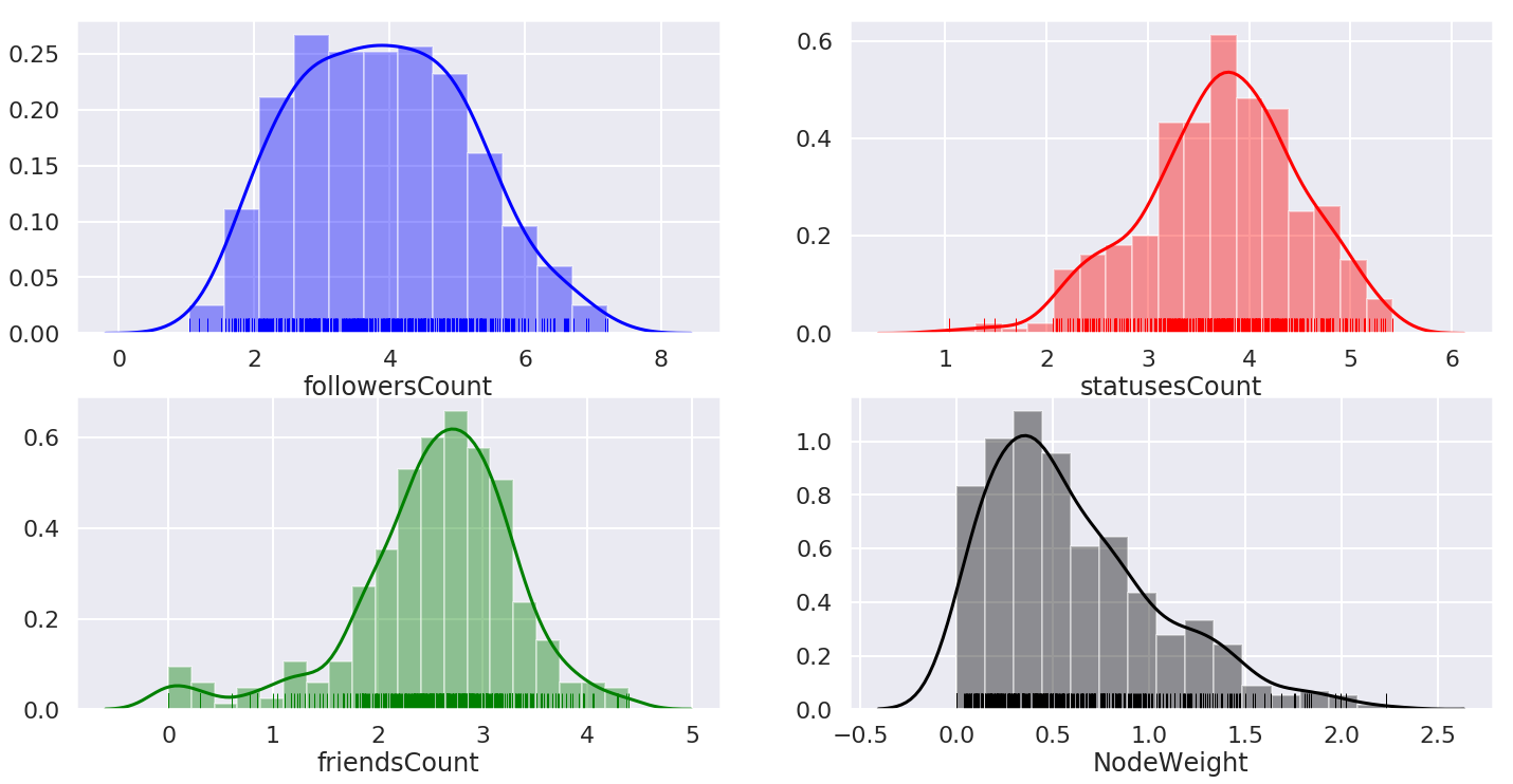
In our network, it appears most users have 1000–10,000 tweets and 100–1000 friends (following). The followersCount distribution doesn’t seem to peak, so there’s a more uniform spread. Finally, most of our nodes have small weights with some users almost 10x more active than the average user in this network.
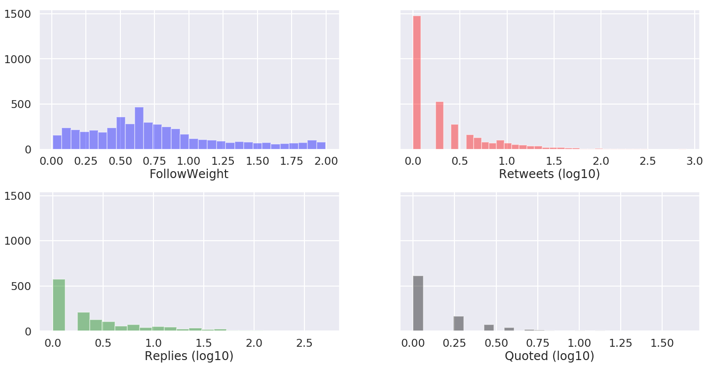
In terms of edges, as expected, most users don’t connect a lot and those that connect have a wide range in terms of the level (5–100 # of retweets, replies) of their recent activity between each other.
Final Network: Bringing it all together
Now we have our network comprised of ~400 weighted nodes and ~10,000 edges (small but with complex relations). Here’s what it looks like after filtering out some isolate nodes: (Note, the size of the nodes depicts the NodeWeight)

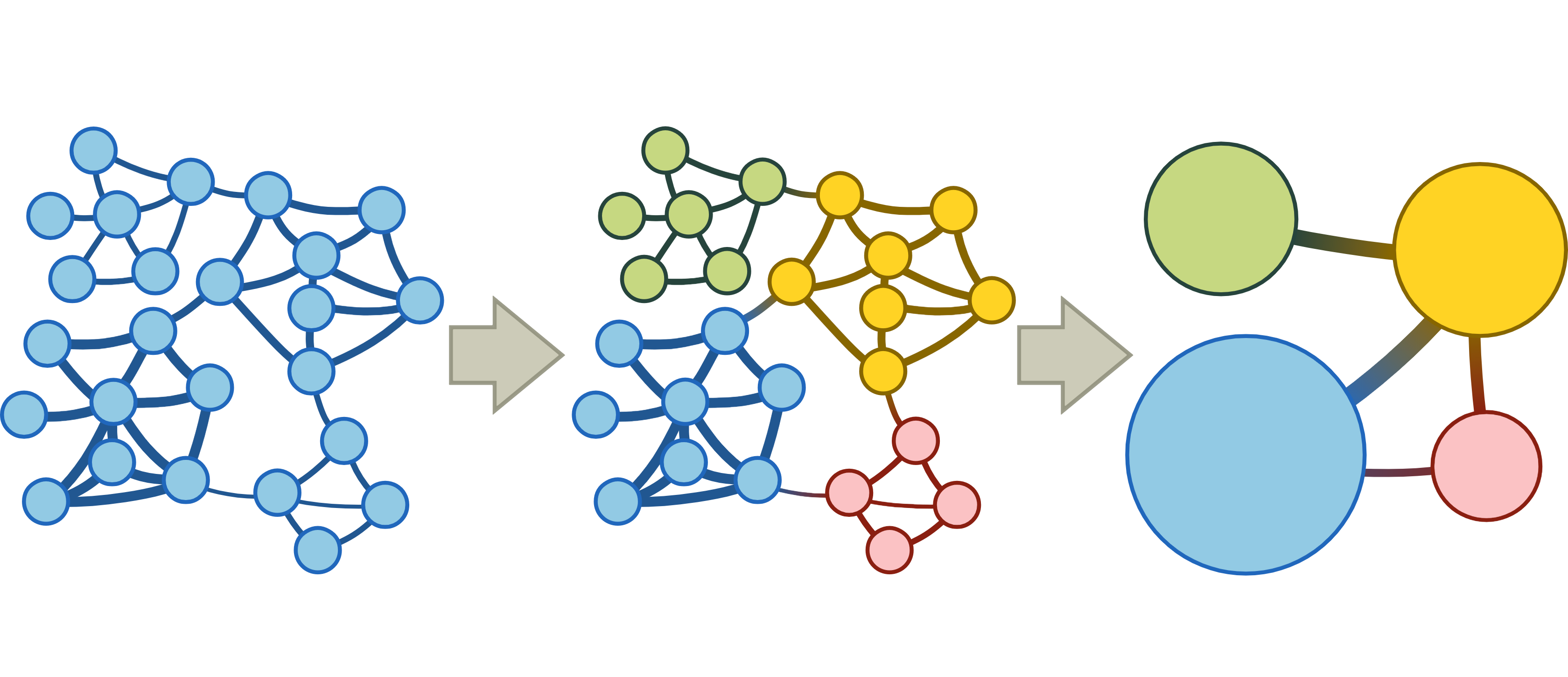
Umm… cool? (Possibly). But really, it will not take us long to realize we can’t get a whole bunch of information out of this. At the moment, this is quite bland (literally, it’s just black and white) and that’s actually one of the challenges we face when dealing with complex networks — that you can’t just ‘eyeball’ insights from them. Which is why before we can really do any significant analysis as a human analyst, we need to see the information ‘clustered’. Algorithmically, clustering the data will also help us for linguistic analysis down the road and is also often used to reduce computation time. A technique to help with this challenge is Community Detection — a powerful process (Figure 3) in which we segment a complex network into communities that categorize the graph structurally as well as depict some higher-order properties latent in the web-like mess you see in Figure 2.
Community Detection
Now comes the colourful part (again, literally), how do we find the hidden communities within our network? I only have about 400-ish friends so if someone is suggesting taking a day and going through them, they’re not ‘wrong’ per say… however, what if we wanted to step away from our human ‘prejudice’ and find communities more ‘scientifically’. If we begin manually categorizing users into communities, we’d know exactly what to do, but in a much more real sense, we have no idea what to do. Difficult questions like ‘how many communities are there in the first place?’ and ‘what’s the criteria for community assignment?’ come up. Therefore, though understandably we may lose some nuance if we use a computer for this categorization process but counter-intuitively, we may actually gain some nuance that our bias would not allow for.
With data science, we are not always dealing with Data because ‘humans can’t possibly do it, it would take too long’. Sometimes, data science is an art consisting of computable aerobic maneuvers that help us see data in a way we never quite could before. (Though often, data science is doing stuff that a person really shouldn’t be doing with Excel. Though they try… they always try…humans.) In this spirit we look towards an interesting algorithm to find communities based on ‘information flow’ — Infomap.
Firstly, what is a community? The reason this has not been specifically defined is because part of the definition of ‘community’ will come from the community detection algorithm. Generically, categorization of information plays a big role in any philosophical or scientific investigations and communities are just that: categorization of nodes that organize knowledge.
What we are essentially trying to capture with communities is to group similar Users together based on the phenomenon of homophily.
“Individuals within interconnected clusters tend to share similar characteristics. This phenomenon is known as homophily and defined as “a basic organizing principle” that “a contact between similar people occurs at a higher rate than among dissimilar people” (McPherson, Smith-Lovin, & Cook, 2001, p. 416). Homophily, known broadly by the phrase “birds of a feather flock together,” captures a key characteristic of naturally occurring social networks and depicts a mechanism through which “distance in terms of social characteristics translates into network distance” (McPherson et al., 2001, p. 416). Put simply, homophily indicates that individuals are more likely to form new social network connections with others who are often very similar to them.”
— Classifying Twitter Topic-Networks Using Social Network Analysis
More specifically, twitter ego-networks contain naturally occurring flow-based communities — naturally occurring as the ‘flow of information’ is not predetermined but is altered by the changes in the topological structure of the network. The nodes (users) establish themselves as carriers of information between nodes through the edges (retweets, replies, etc.). In this sense, when we are looking for communities, we are looking at flow-based methods of community detection so that “communities consist of nodes among which flow [of information] persists for a long time once entered” (Map Equation Framework Tutorial). This is different than cutting up a graph into blobs based on the structural composition of our network model. We will see more later on how a flow-based community detection algorithm may not always separate networks structurally.
Infomap is a flow-based community search algorithm based on optimizing the ‘map equation’. I do not want to get overly technical here so will leave readers to explore on their own if interested, especially since the authors have made some phenomenal demos depicting the mechanisms of the map equation and have a written tutorial to guide you along.
After some trials with Infomap, I found that though it categorized a lot of communities well, there was generally one large blob of nodes that it categorized together as a community that felt like ‘left overs’ nodes— users that quite possibly belong in multiple communities and contribute to a more complicated flow of information. To segment this large leftover community further, Walktrap, another community detection algorithm but one based more so on node-similarity and the structure of the network — nodes A and B are classified in the same community if the probability to get to all the other nodes from A and B separately are similar. Probability to get from one node to another is calculated using ‘random walks’ which also has a neat intuition behind it.
Fundamentally, after applying these algorithms, our community detection takes the following organizing principle: Users are grouped together if tweets and follows (information and impressions) seems to persist within them — such that their activity among each other is high. As for the larger leftover group of Users (who have a regular activity among each other and flow of information does not persist among any specific smaller group of users), they are further segmented into mini-communities based on how similar their behaviour is within that larger group. Figure 4 displays a histogram of the community sizes in our network.
An intuitive reason for why those two community definitions differ is we can have myself and my friend Qasim who do not retweet each other’s takes (because that would be to admit defeat) constantly retweeting the takes of a third-party political analyst. A similarity-based detection would lump my friend and I in the same community (i.e. we have similar behaviour), a flow-based detection would not (i.e. information does not flow through our connection).
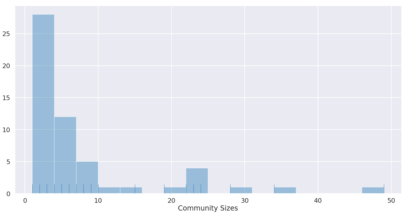
The distribution highlights what seems to be intuitive (at least in the way I use Twitter): we have many small communities — usually structured around a specific taste/event/interest/topic — and then some major big players which in this case contain anywhere from 10–50 users.
Note: Of course, some users have ‘membership’ in multiple (conceptual) communities in any given social network, but for this project, we will not deal with overlaps and multiple memberships. Partially, this is because I would like to see a User to be assigned to its most dominant community out of all those it belongs within, and partially, because it would make the computation unnecessarily complicated and I could not find convenient enough libraries to do said computation.
Observations & Analysis
And finally, we get out marvellous ego-network that looks like a buzzing 3-star hotel (If you get this reference, please also connect with me on Twitter immediately). Once again, node sizes depict node weights (how ‘active’ the user is) and edge thickness depicts the edge weights (how strongly connected 2 users are based on their activity with each other).
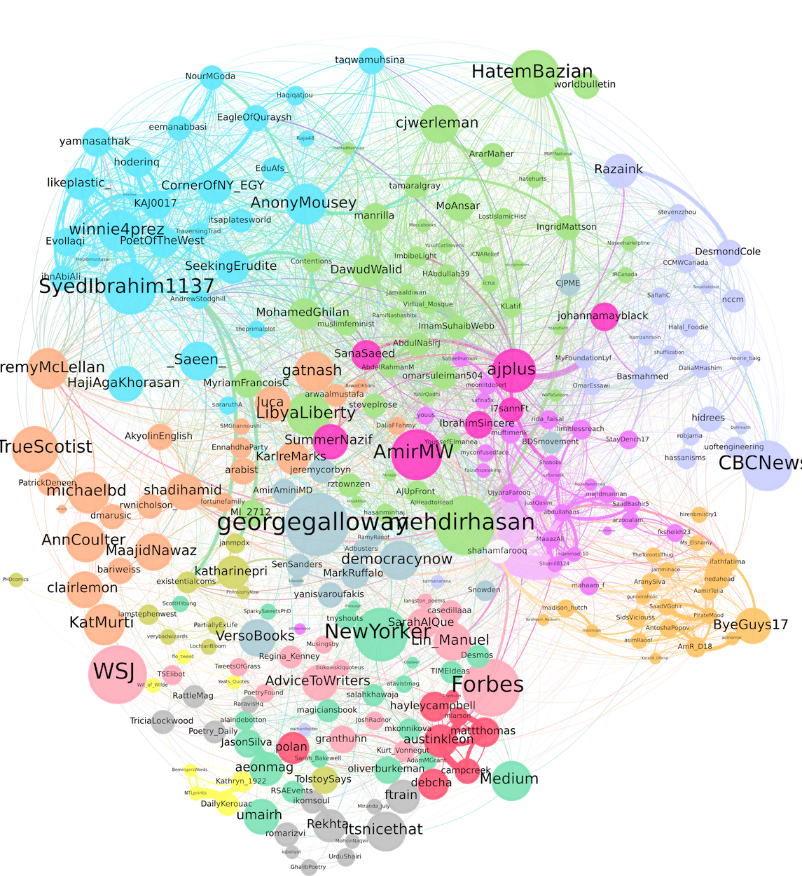
FYI, the white dot to the right of the centre is me (as Nietzsche prophesied, I know nothing of myself… I am not even the centre of my own community…). Speaking of egos, I think a part of us always wants to be analyzed and that kind of attention is not always easy to come by — so this is like a DIY version of getting attention. Having done this analysis on my personal network allows for me to compare the algorithmic output with my own human intuition and — following the example of some of my earlier projects — that’s exactly what I intend to do. The rest of this post will highlight some methods of extracting insights from our network graph.
Reminder that this is a community analysis of an “ego-network” and therefore, not an objective classification of any given user on Twitter but a classification of the role they serve in my network from my perspective.
Visualization’s Analyzing Principles
Inter-related Position — When we are analyzing the communities, it is important to remember that the exact position of a node (south, north, east, west) does not really matter but it’s relative position to other nodes is no accidental. Although these is some randomness involved in the visualization, it is actually modelled through a mixture of attraction, repulsion, and gravity forces. Therefore, strongly connected nodes will attract each other and non-connected nodes will repel.
Intra-related Position — The position of nodes within the territory also matters. Nodes further from the central position and deeper into the community reflect more niche behaviour and information-flow properties.
Density — More dense collection of nodes implies stronger interconnectivity. Sparsity implies weaker interconnectivity.
Modularity — A measure of clustering quality, how disconnected communities are with each other. “Highly modular networks are characterized by a few highly intraconnected clusters that are loosely interconnected. Networks where users are highly interconnected regardless of cluster affiliation are, therefore, less modular.”
Bridge Nodes — Nodes found on the border of communities can sometime act like a link, loosely interconnecting the two communities.
Outliers — Nodes far away from the structural territory of their assigned community. Sometimes these are mis-categorizations, sometimes far off bridge nodes.
Community #1-2: Real-life People & Their Real-life Friends

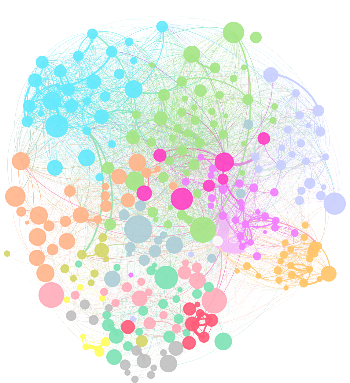
These two communities generally contain my personal connections or friends (‘followings’) of them that I followed, separated between my dominantly high school connections and ones outside high school. Therefore, it is understandable that they are dense (i.e. strong intraconnections). I see an interesting spatial representation with my high-school connections put away from the centre and thus away from the rest of my generic network (i.e. in the twitter world, we’ve grown apart, understandably, some of them are not even active). The ones I interact with more often among this community are closer to my node. Furthermore, stronger friends (or those I know to be at least) also appear more closer to each other, relatively compared to others in the community. Overall, these are strong, well-defined community and agree with the real system — this segment of the Network has strong modularity.
Community #3: Toronto Life (right-most with CBCNews)
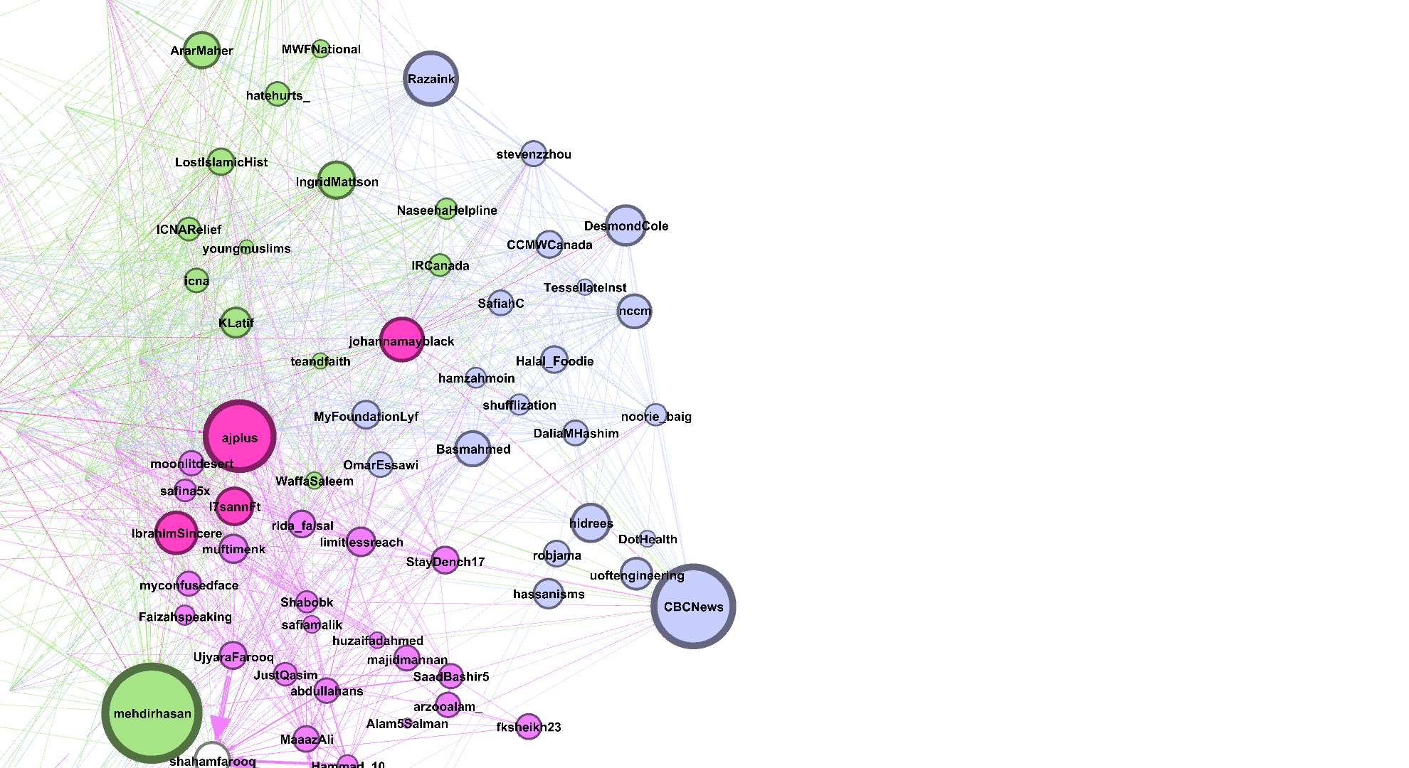
Another strong community, strategically centred a little further from my personal connections. This community contains mostly Toronto/Canadian users of varying topics. It’s interesting that ‘@hidrees’, ‘@DotHealth’, ‘@robjama’, and ‘@uoftengineering’ are together but spaced a bit further away from the rest — that’s a Toronto-Canadian business-tech mini-group. While as we go north, we get more activist/journalist/political-commentary folks like ‘@DesmondCold’ and ‘@stevenzhou’. Nodes like ‘@IRCanada’, ‘@NaseehaHelpline’, and ‘@IngridMattson’ are good examples of users that are structurally closer to this community (and Canadian) but in terms of flow are more involved with another community. Overall, the cluster is loosely connected to the rest of the network with loose intra-connections other than some mini groups. This implies the community is not too closed off and contains varying connections with my more central network.
Community #4–5: The Main Act (Green) and The Misfits (Pink)

This is the largest spanning community (area wise) and it’s immediately obvious why — we have many users that float out into the territories of other communities. I call this community the ‘main act’ — and I feel every twitter User has a community akin to this in some regard — because many of my other communities ‘watch’ this community, sort of like a play.
- We see mainly big accounts, popular personalities who engage with each other as others watch them. In my case, we see Islamic scholars that comment on world affairs bunched in the centre, connected to multiple Users from other communities.
- We can also see a trend of more general journalism and content to more Muslim-specific as we go North-West-ish. As we go North, the Users are much less engaged with other central topics within my Network.
- Those users on the outskirts of this communities territory act like bridges connecting more niche community with the general.
- There are some outliers I have highlighted who’s recent activity assigns them to this community but I find would have been better with a more structural assignment.
The community in pink — the misfits, which I do not mean in any derogatory way — is a weak community. These Users are not deep enough actors in the information flow with the communities structurally close to them and so seem to be classified together haphazardly. This can also be noted spatially as the community is spread out and sparse with loose intraconnections and stronger interconnections.
Community #6: The Infamous MuslimTwitter [MT] (Blue)

This is the infamous Muslim Twitter community, one of the only community, aside from my personal communities, that is segmented both structurally and in terms of information flow. Personally speaking, this is one of the most interesting niche communities and worthy of an entire analysis on its own in terms of its dynamics and informational flow structure.
- The sibling/close-friends trend is visible here again, with siblings being placed close together.
- MT’s territory in my network is quite modular — they are loosely interconnected with the rest of my network but have strong intraconnections. This is immediately visible as we see a more tighter mini group in the North-West centred around the 2 highly active siblings while the rest of MT is sparse. (Once again, this does not mean they objectively function as the hub of MT, only in my ego-network).
- I have also highlighted the bridge nodes that act like links between the MT I follow and the Scholar’s circle I follow that I previously discussed in the Green community.
- Bridge nodes can certainly go either way, some of the nodes like ‘@_Saeen_’ belong more so in the network below while ‘@JeremyMcLellan’ might belong in MT. This is iron clad proof ‘@JeremyMcLellan’ is a proponent of #creepingsharia — those in MT will understand this joke :D.
Community #7–9: Big-Idea Political Commentary (Orange), Socialists (Grey), and Philosophy (Dark Yellow)
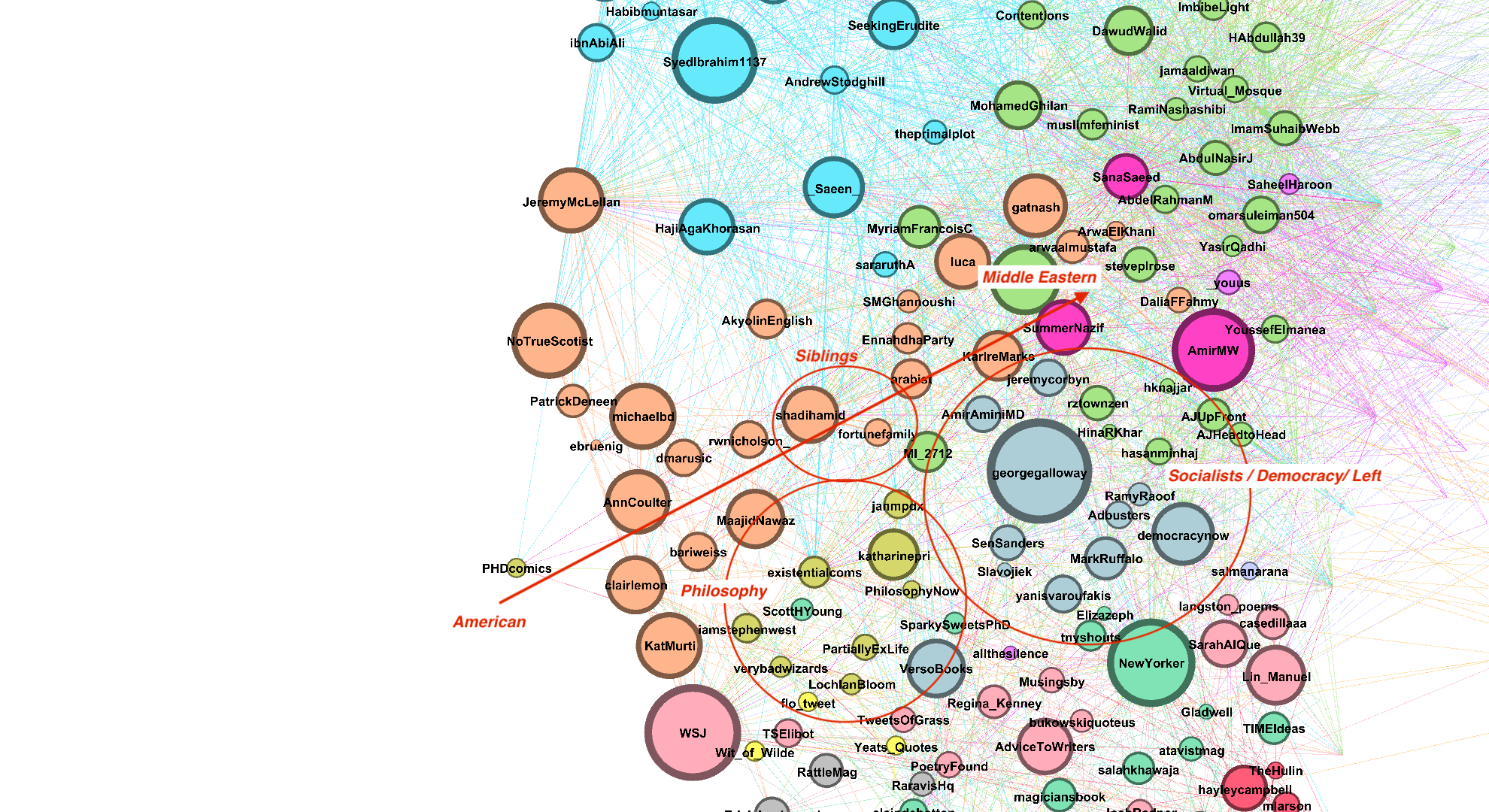
A very fun group of communities — now we’re deep into politics and philosophy.
- This segment of the graph has lower but reasonable modularity compared to others, the communities are close together yet they are also clustered somewhat densely implying strong intraconnections.
- The orange community are the strong political commentators — I’m talking your big idea politics, from Islamism (pro and anti) to Catholic States, to members of the ‘Dark Web’. We can also see the American discussion on the outskirts and the Middle Eastern towards the centre with ‘@shaadihamid’ in between (as he should be, an American with an emphasis on middle eastern Islamist politics).
- We also have our Socialists and Democrats and The Left (Grey) who are more or less tight together. It’s interesting that unlike the generic big idea political commentaries, these are not as separated by region with both American Socialists and European Leftists together (Sanders, Corbyn, and Varoufakis).
- The Philosophy Circle, though mainly educational accounts, is pulled away from the more southern groups by multiple connections in MT (blue community #6) and the big-idea political community.
Community #10–14: The Inter-Connected South
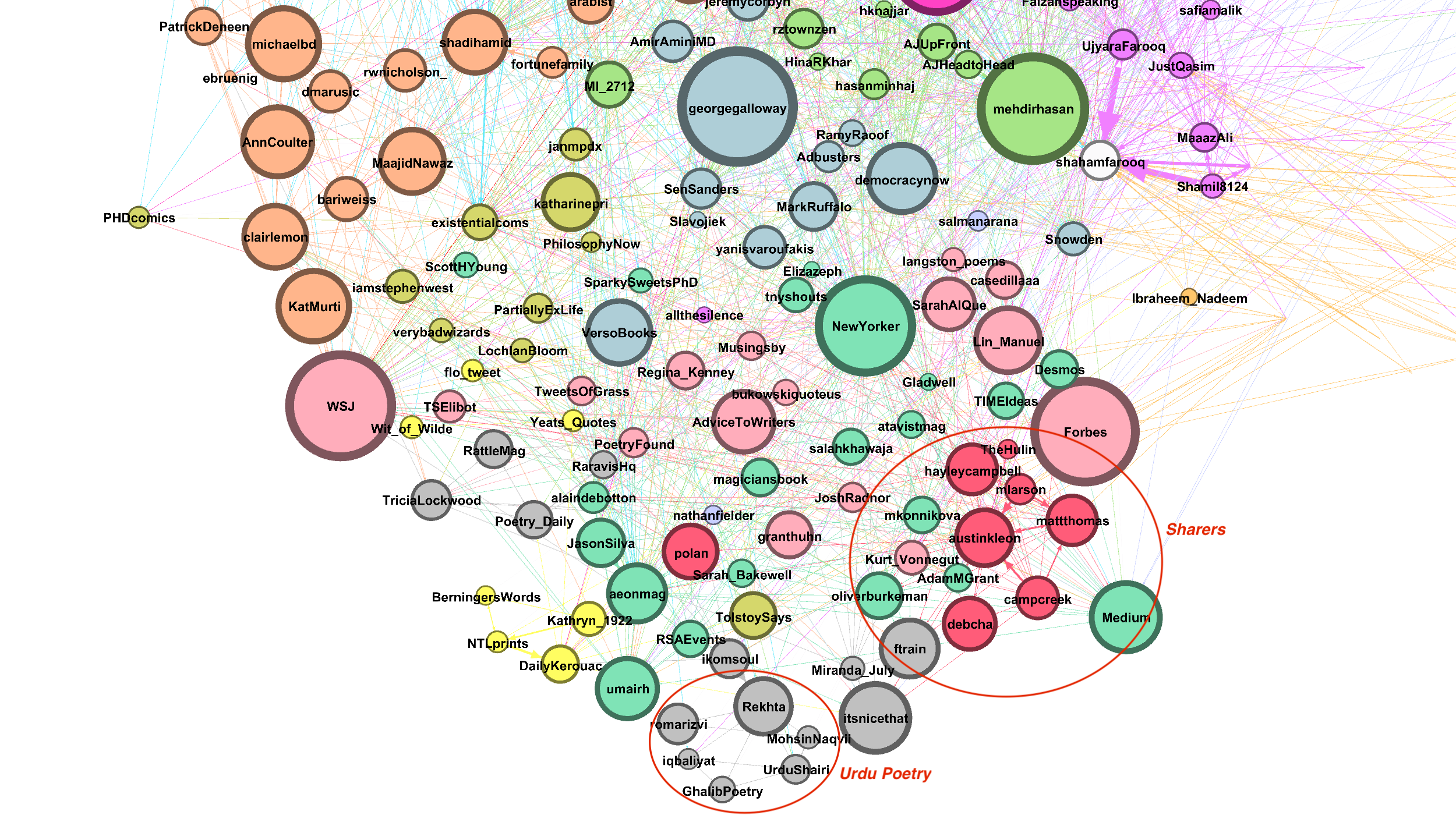
The southern area of the network is the least modular. Though some dense mini-communities exists, overall we have a large amount of structural variance and interconnectedness between communities — reflecting the tendency of these sort of communities to mingle and interact with one another.
- Nodes in this region are mainly about art, reading, and writing with some business. Large nodes of publications, magazines, and journals are scattered across the region.
- The ‘Sharers’ — as they share a lot of interesting content pertaining to the topics of this region — are a tightly packed community centred around ‘@austinkleon’. We also have a niche Urdu Poetry community separated from the rest.
- I find ‘@Versobooks’ as a nice bridge node that connects philosophy, The left, and communities of writers/readers.
Extra: Network Timeline
How the Ego(-network) Came to Be
Let’s add another dimension: Time. Similar to how we’ve talked about Bridge Nodes that act as links between various communities, there are nodes that act as Exposure Nodes that expose us to a new community. If we see the network as it grows through time, we can take note of some of these specific nodes. We can also some patterns of how this specific ego-network grows.
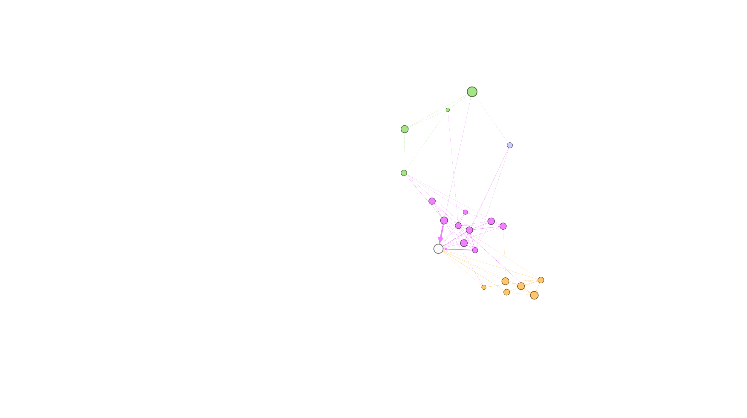

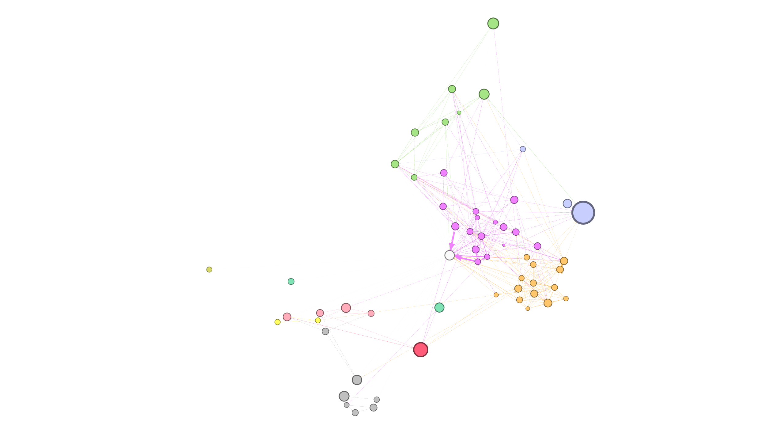
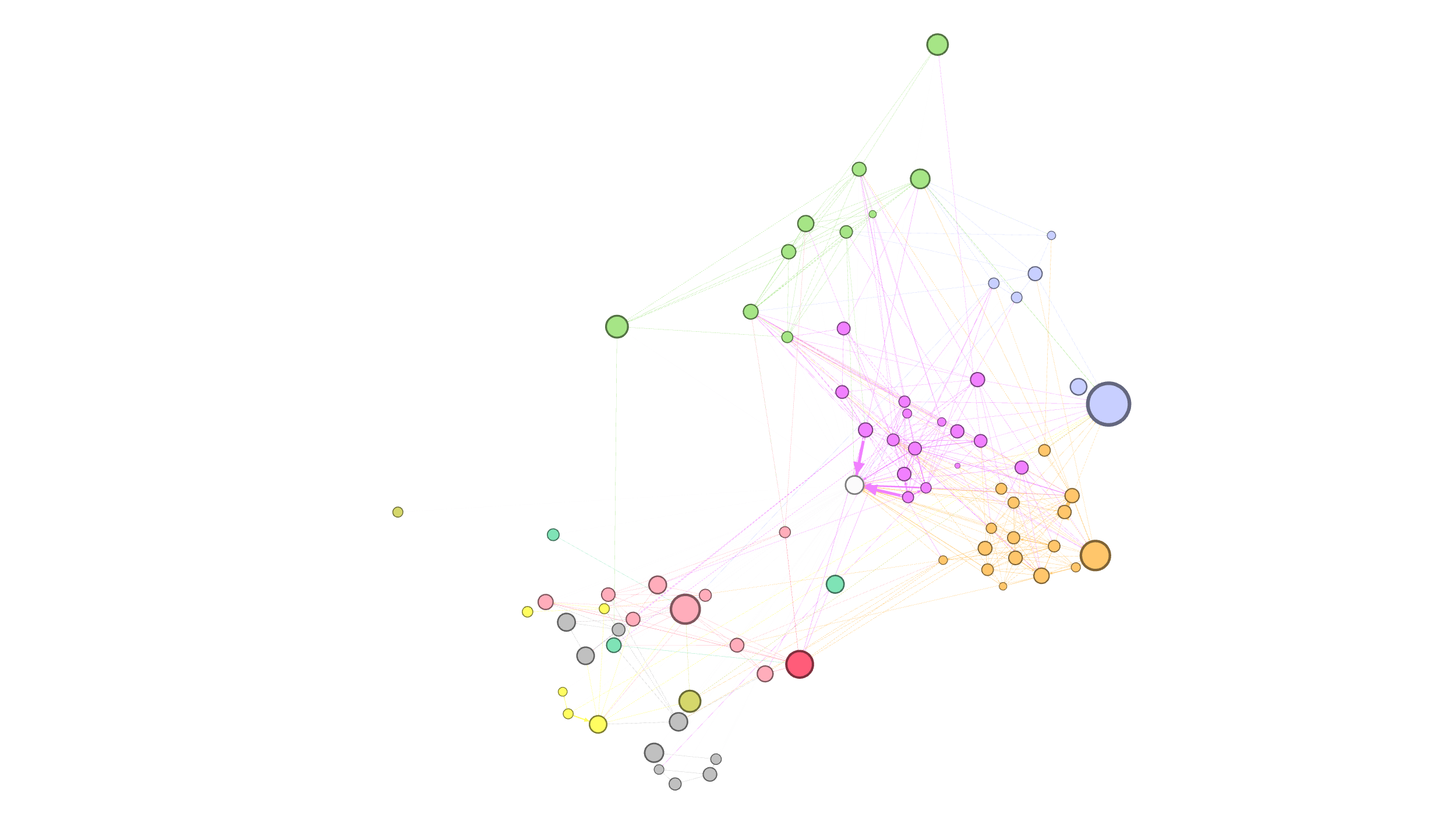
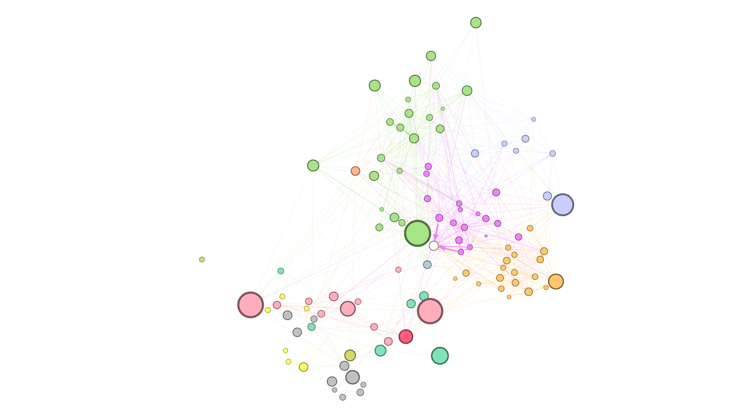
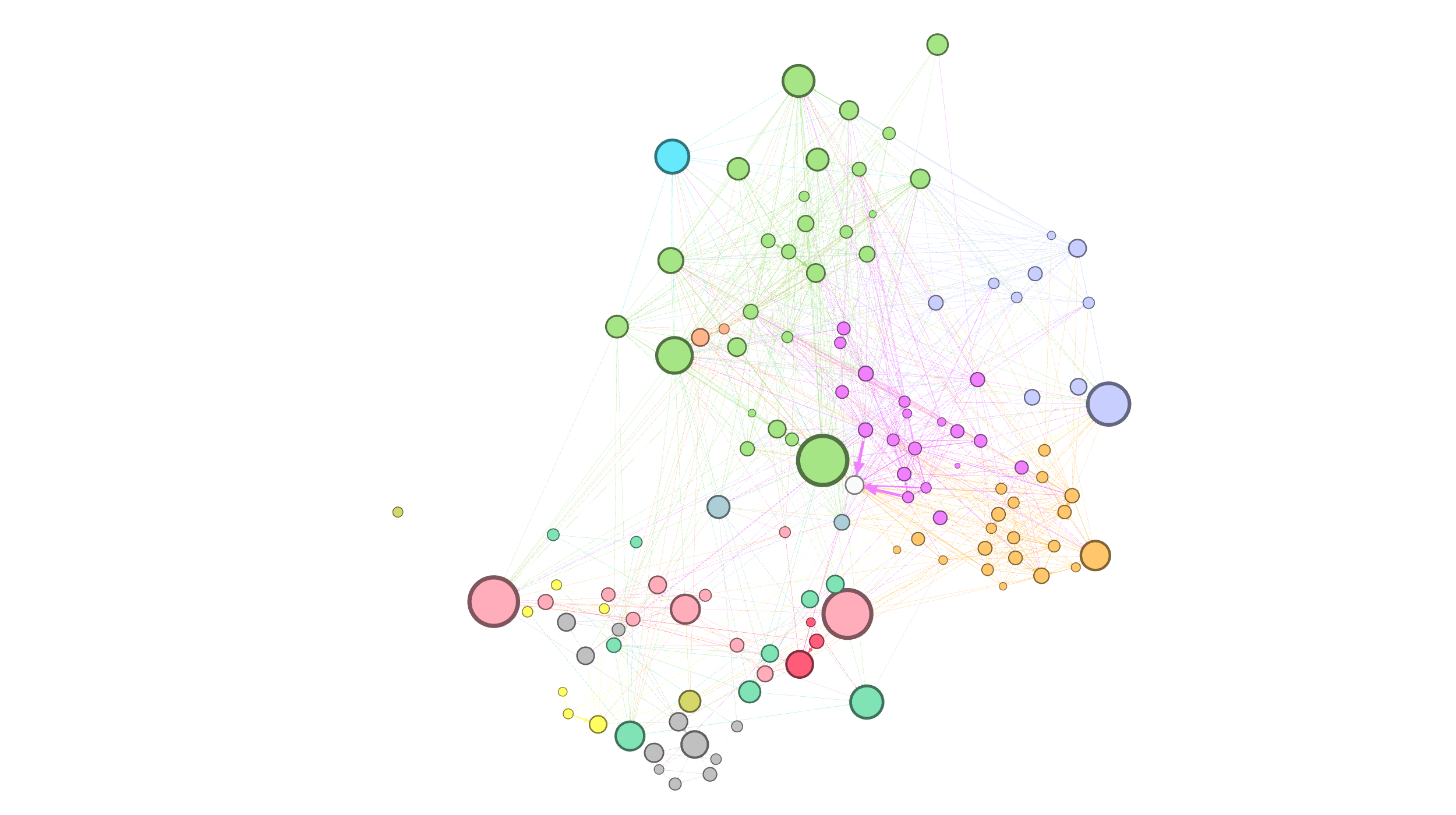
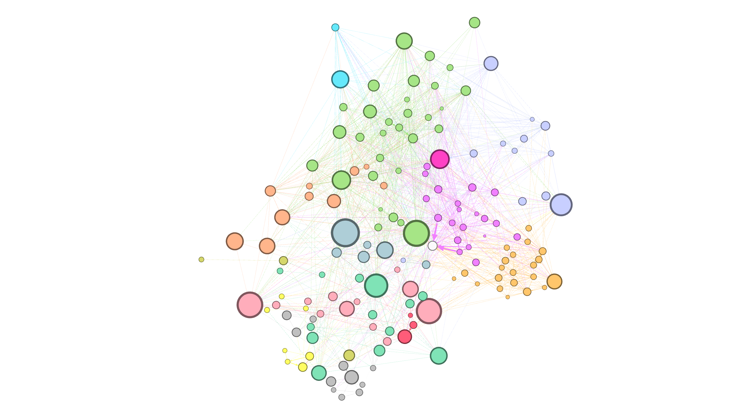
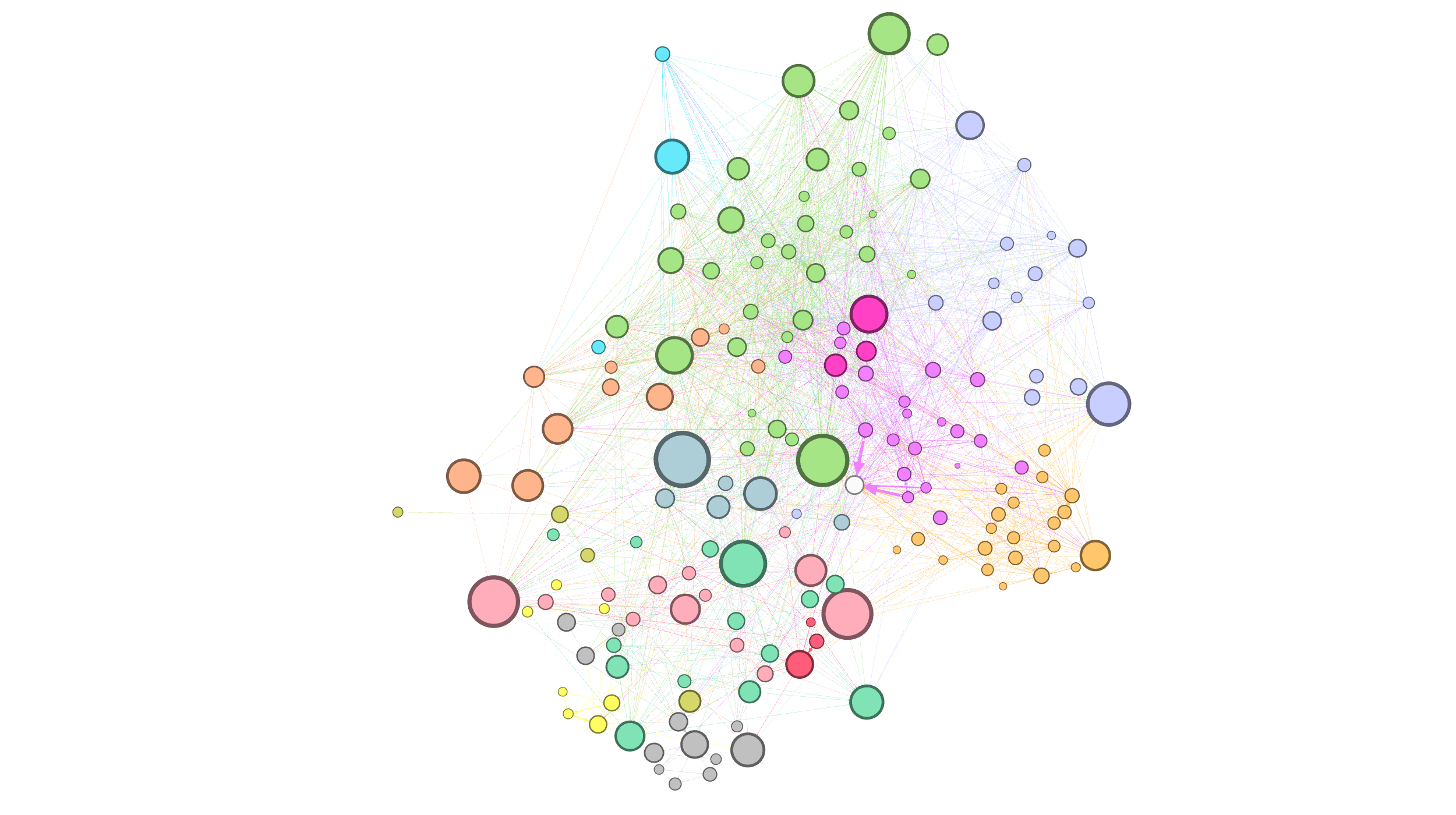
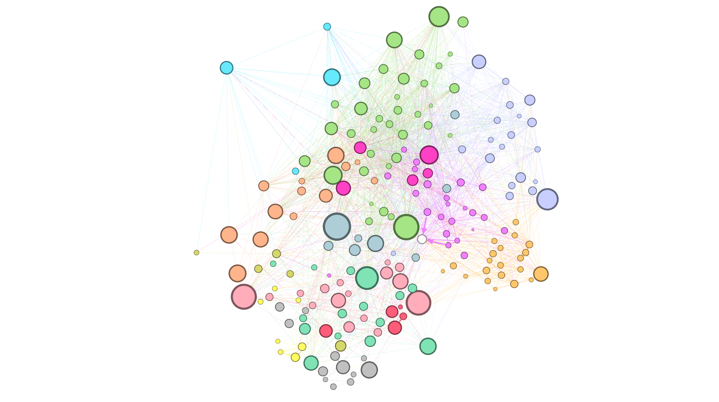
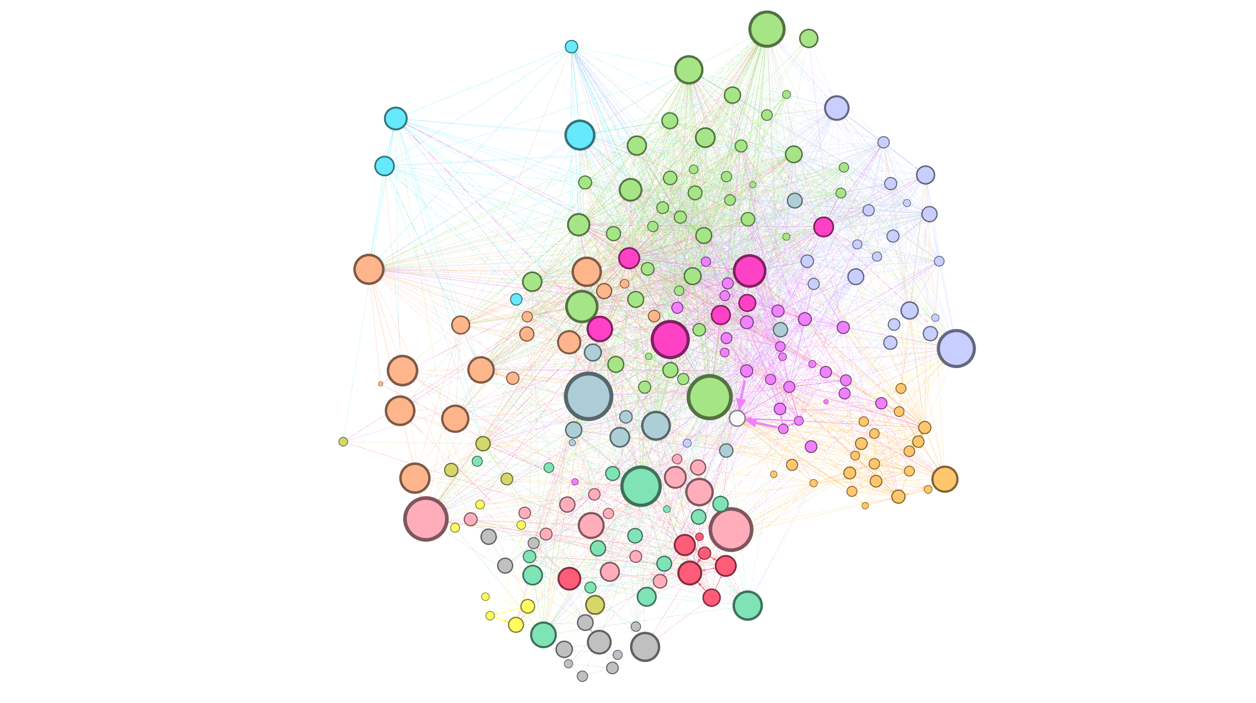


Theres a nice pattern that can be observed in this manner of growth: we see modular areas of the network (highly intraconnected) have a high growth rate in a given time period and then reduce to a low while non-modular areas steadily accumulate once they begin. We also see that ‘exposure nodes’ (those that introduce us to a community) are not necessarily ‘central’ nodes of that community but bridge nodes. Good examples of such nodes are the red node in the first image of Epoch 2 and the blue node in the first image of Epoch 3.
Concluding Remarks
- This was my personal network, so a large amount of understanding I could extract from this analysis was already ‘known’. But imagine performing this analysis for any given user that we have never interacted with and the high-level aspects of taste, groups, interests, and growth we can understand about them…
- Most data analysis (especially network based) tries to gain objective truths and understand large, celebrity trends. While that has it’s purpose, for some reason, I do not come across a lot of analysis attempting to extract subjective behaviours and in depth insights on a smaller scale… I feel this is a gap that, if addressed, could lead to some interesting insights.
- There are quantitive measures to calculate modularity, intraconnectedness, interconnectedness, etc. that I did not explore here that readers can look into (I just prefer qualitative analysis for posts like this, it makes for a more interesting project).
- In summary, the main point I took from stage one of this project is that relative relationships in our network model mimic the relative relationships in the real system! This provides some credibility to explore more in-depth analysis on this network model and community segmentation.
